Sinergo
Sinergo
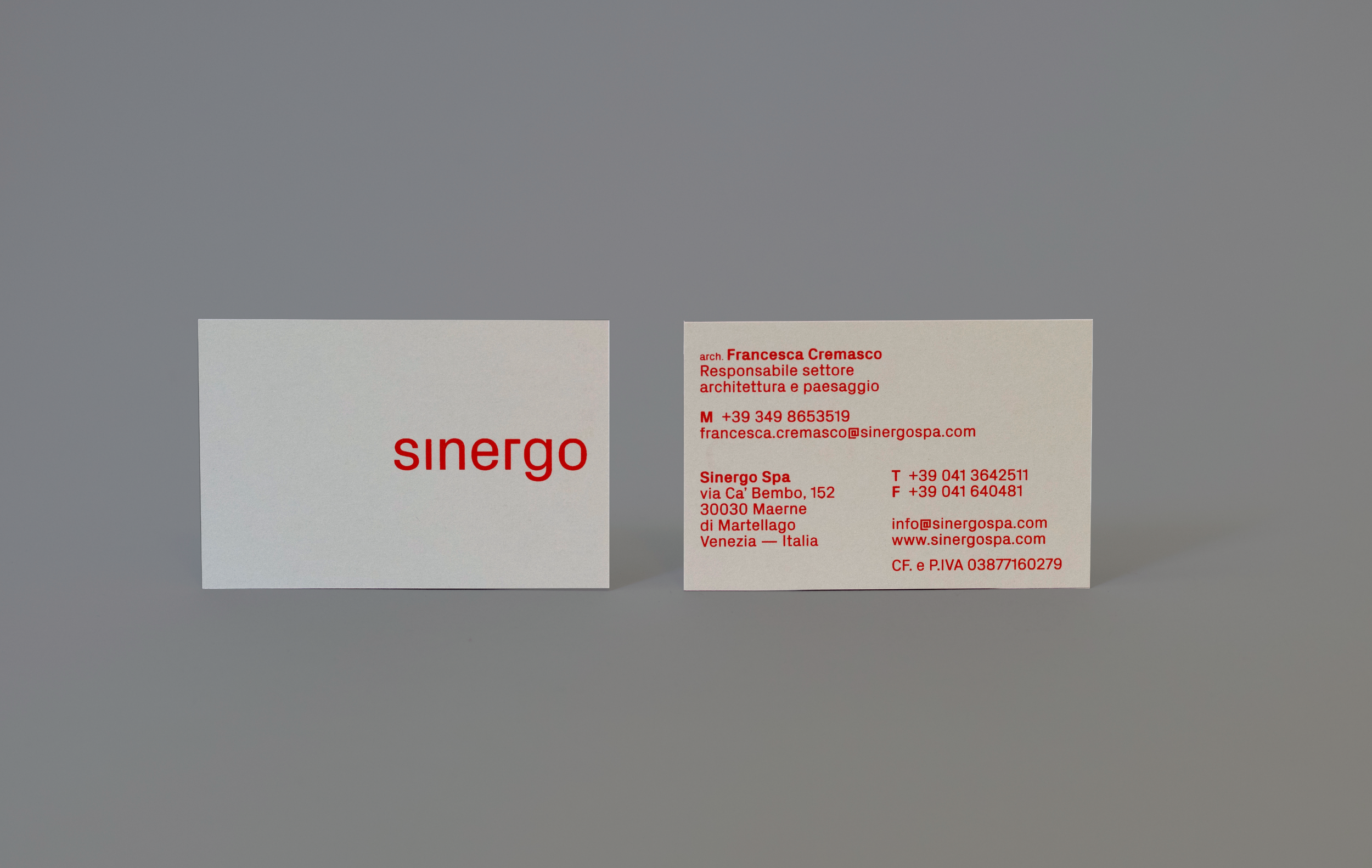
Sinergo is an architecture and integrated design society that is working with a multidisciplinary approach to complex projects, on both public and private commissions. Tasked with revamping their logo and brand identity, I was also entrusted with the adaptation of various essential materials utilized daily by the studio, including folders, notepads, and business cards.
The previous logo failed to capture the essence of the company's identity.
To address this, I suggested a typography-focused logo utilizing the Px Grotesk typeface, chosen to reflect the multifaceted nature of Sinergo.
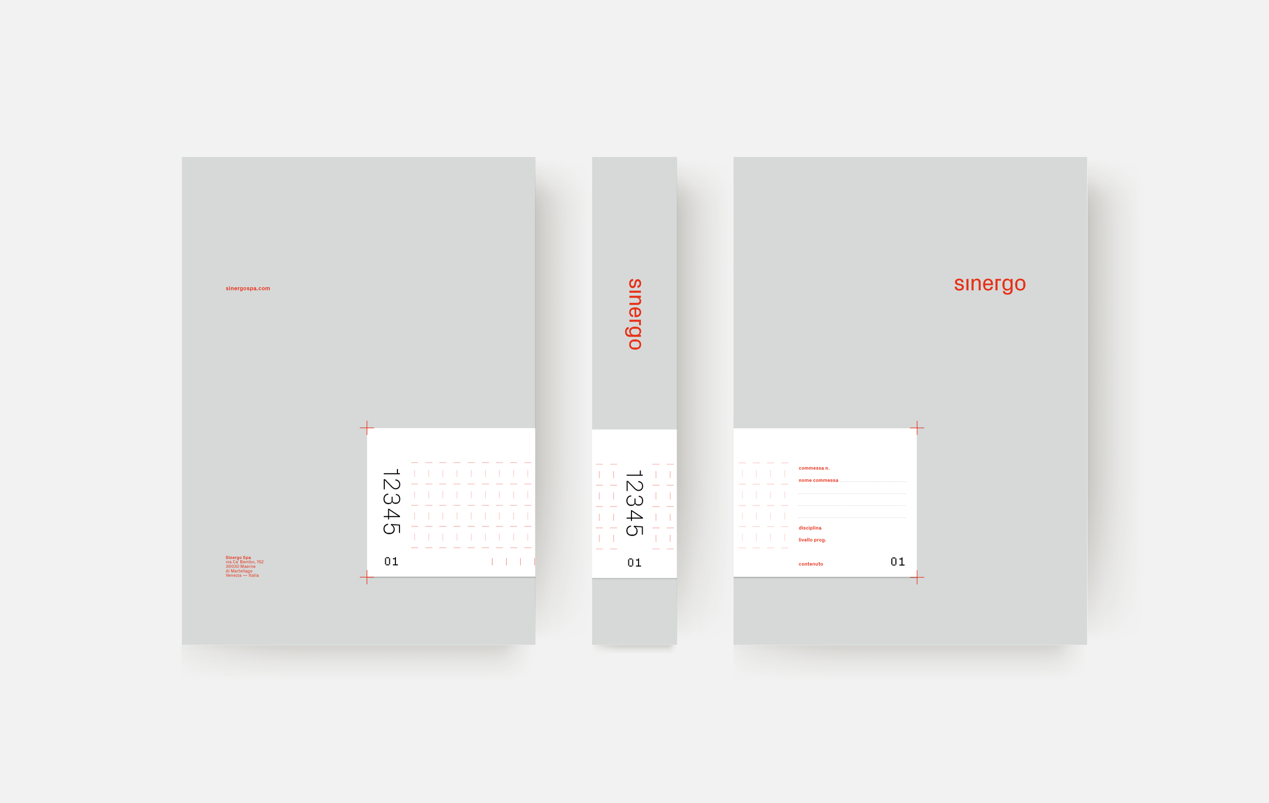
The letterforms were carefully selected to evoke associations with architecture and engineering. This inspired the creation of a grid system, serving as the foundation for Sinergo's brand identity. This grid connects the structural elements found in architectural plans with Sinergo's brand image.
Following this, I adjusted the color palette to align with Sinergo's identity. This involved desaturating the black and opting for a vibrant shade of red, injecting energy and vitality into the brand. The outcome? An elegant and dynamic aesthetic perfectly suited to the studio's ethos.
In addition to refining the identity, I devised a labeling and folder system tailored for various-sized folders, ensuring seamless printing on identically-sized labels within the studio.


